Monday, September 26, 2011
Sunday, September 25, 2011
paper cut research
i was very into peter callesen, bovey lee and emma van leest
i really think that they are awesome
:D
but i realise that there are so many more paper artists out there
i guess this is what i think i didn't do enough for my coursework
i should have done more research D:
Peter Callesen:

he's paper cut always only consist of one single sheet of paper, which i guess is what makes his works so cool. how on earth did he manage to cut that from just one paper??? i love how he makes use of the negative shape and creates a 3d model and how it interacts with the positive space. example: human and skeleton, dead and alive flowers etc.
Bovey Lee:


awesome intricate and fine details
seriously all the patience and time spent
佩服佩服
i like her chinese influence actually :D like the chinese pagodas
i think she uses rice paper
Emma Van Leest:


her style is rather similar to bovey's both 2D paper cuts
but emma does layering creating shadow combining her 2D with depth
and she plays around with the colour of the papers
i think i should have tried exploring these areas
and i didn't know she had these series of artwork


cool right?
i guess i can't really do this as it requires light
i love the layering effect
how every layer is independent
but yet they interact with each other
wonderful planning :D
okay.
its sad that i only knew about the following artists below today D:
they are awesome too
Aoyama Hina:


another artist that does stuff similar to bovey and emma
crazy fine details
i like how her paper cut seem to look like lace
pretty eh?
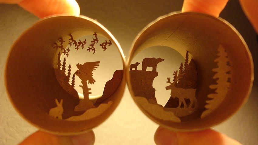
Anastassia Elias:

she use layering of cuts like emma does
i like how hers are simple yet so beautiful
layering creates depth to her work
and again i like each layer link to one another
and i like her use of a rounded frame which i find very unique
Ingrid Siliakus:


totally crazy and impressive
i love 3D paper cut but i can't really do it D:
ingrid's works look like some sort of architecture
and it reminds me of children pop-up books
:D
Stephanie Beck:

another mind blowing details artwork
simple shape and lines forming an impressive pattern
like some sort of network
beautifully done
Natasha Bowdoin

similar to stephanie's but she does layering, placing cut peieces on top of another, creating 3D-ness to her work
she also plays around with colours, giving every layer a different colour
her works are also very large in scale, hence very impressive
i shall end of with a nice photo :D
i really think that they are awesome
:D
but i realise that there are so many more paper artists out there
i guess this is what i think i didn't do enough for my coursework
i should have done more research D:
Peter Callesen:

he's paper cut always only consist of one single sheet of paper, which i guess is what makes his works so cool. how on earth did he manage to cut that from just one paper??? i love how he makes use of the negative shape and creates a 3d model and how it interacts with the positive space. example: human and skeleton, dead and alive flowers etc.
Bovey Lee:


awesome intricate and fine details
seriously all the patience and time spent
佩服佩服
i like her chinese influence actually :D like the chinese pagodas
i think she uses rice paper
Emma Van Leest:


her style is rather similar to bovey's both 2D paper cuts
but emma does layering creating shadow combining her 2D with depth
and she plays around with the colour of the papers
i think i should have tried exploring these areas
and i didn't know she had these series of artwork


cool right?
i guess i can't really do this as it requires light
i love the layering effect
how every layer is independent
but yet they interact with each other
wonderful planning :D
okay.
its sad that i only knew about the following artists below today D:
they are awesome too
Aoyama Hina:


another artist that does stuff similar to bovey and emma
crazy fine details
i like how her paper cut seem to look like lace
pretty eh?
Anastassia Elias:

she use layering of cuts like emma does
i like how hers are simple yet so beautiful
layering creates depth to her work
and again i like each layer link to one another
and i like her use of a rounded frame which i find very unique
Ingrid Siliakus:


totally crazy and impressive
i love 3D paper cut but i can't really do it D:
ingrid's works look like some sort of architecture
and it reminds me of children pop-up books
:D
Stephanie Beck:

another mind blowing details artwork
simple shape and lines forming an impressive pattern
like some sort of network
beautifully done
Natasha Bowdoin

similar to stephanie's but she does layering, placing cut peieces on top of another, creating 3D-ness to her work
she also plays around with colours, giving every layer a different colour
her works are also very large in scale, hence very impressive
i shall end of with a nice photo :D
sec3 block test 1 answer

1a)
artist and model, by liu kang, depicts a man, who is chen wen hsi, drawing a picture of a Balinese women.
the artwork is separated in to three main sectors, the sky, the mountains and the foreground. the sky is painted blue, with rectangular shaped clouds the mountains are painted an unrealistic colour, navy blue and are partially covered by a layer of shrubs and vegetation, which are painted a dark shade of green. the colours used for these two sections are mostly cool colours like green blue.
in contrast, the colours used in the foreground are much brighter. the artist, wearing a yellow hat, a cream-coloured shirt, grey pants and clack shoes, is sitting on a rattan chair, with a red hand carry bag behind. there is a shrub with blooming pink flowers behind the bag and there is a scroll of paper placed on the ground beside the artist. there is another rattan chair further behind, and a small table, seemingly made of the same materials as the chairs, with a red teapot and two red teacups placed on it. on the left hand side of the artwork, the model , a Balinese woman, is topless and resting her head on her left hand. there is a red and yellow, what seem like flowers on the model's head. the bottom of what the Balinese woman is wearing has simple patterns on it. there is another bush of pink and yellow flowers behind the woman. the ground is painted a flat colour of light green.
hibiscus, also by liu kang, depicts three Balinese women with fruit baskets and flowers, accompanied by a boy.
the artwork has a very light coloured background of brown. the right hand side of the artwork, there is a naked little boy that is partially cropped off by the frame. he is wearing bangles on both his hands and legs, and is holding to what seems like yellow fruit. in front of him, two Balinese women placed fruit baskets on their head. the wrapped their hair up using cloth, in a turban style. the fruit basket consists of bananas, pineapples and more. the Balinese women are topless and barefooted, and they are wearing a skirt like bottom with simple patterns. the woman closer to the boy seems like she is dancing and there is a plant with hibiscus blooming behind her. the Balinese woman in front of her has a hibiscus in her right hand and she looks like she is smelling it. there is another Balinese lady behind them. she is also topless and is wearing what seems like a traditional turban and skirt. there is another hibiscus plant in front of her.
1b)liu kang was known for combining the east and west influences to achieve a personal style. for artist and the model, the most obvious eastern influence would be the use of white outlines, which is most likely influenced by the batik prints. another interpretation of the influence of the white outlines would be van gogh, a post impressionist, who is influenced by Japanese ukiyo prints to draw outlines.
the bold use of complementary colours, like red and green, orange and blue, is most likely influence by the fauvist style, for example, Matisse's the green stripe, where the artist paints a bold green stripe down the face of he model and uses red as background.
liu kang drew this artwork in a Chinese landscape format, there there is no fixed focus point of vanishing point, allowing the viewer's eye to travel . also, the colours used for" artist and the model" is rather flat and has little spatial depth.this may also be an influence of the fauvist style.
one can see that the artist achieved the sense of spacing using the arrangement of matters, instead of the usual shading, which may be in influence from the Chinese paintings landscape format. the paints are applied in flat planes of colour, for example, the clouds, and this is most likely an influence from post-impressionism, Gauguin.
this artwork obviously uses eastern subject matter for example Balinese woman, tea cups, rattan chair and also the background of the painting reminds one of Chinese 山水画.
liu kang did not draw shadows and eliminated the details. this is mostly influenced by fauvists once again.
as for hibiscus also by liu kang, the background is left blank, which is like chines traditional ink paintings where artists 留白 to give a sense of space. the subject matter is also eastern influenced. for example, the Balinese women, and also the presence of hibiscus, which is a south east Asia flower. unlike "artist and the model":, this painting uses brown outline instead of white and the line varies, thick and thin, reminding one of Chinese calligraphy strokes. again it can also be interpreted as van gogh's influence.
sec4 block test 2 answers
2a)

growth, by han sai por, depicts five seedlings slightly white/beige in colour. the forms are well-modeled and well-defined. the top of the seeds seems to point towards one another, suggesting growth of seeds and its transition. the surface of the sculpture is extremely well-polished and smooth, with gentle and fluid curves. the sculpture is also rather minimalist and the artist chose toe eliminate and reduce the sculpture to its bare essentials.
the seeds depicted are much larger than those in real life. standing 11.2 x 88.5 x 40cm, they are easily up to 10 times the size of normal seeds. this perhaps suggest growth in a way that the seeds grow in size and height.
the sculpture gives a rather pleasing and pleasant feeling, slightly tranquil in a way that han sai por chose to use marble as her medium.marble is usually smooth and cool to touch, and the fact that the seeds are white gives a rather pure and peaceful feeling and atmosphere.

looking ahead, by ng eng teng, depicts a human form, eliminating most of the body parts, leaving only the essentials, like the head, arms and thighs. the hands of the sculpture are placed on the head, with one elbow resting on the thigh. the head seems to look into the distance, as suggested by the name of the artwork ' looking ahead'. ng eng teng chose to use bronze as his medium hence the sculpture is grayish brown in colour. the forms are rather well-defined and mostly polished. yet the artist left visible marks on the sculpture, giving it texture and roughness. the thighs of the sculpture is extremely exaggerated in a way that it is being blown up to nearly twice the normal size.
the artwork seems more somber due to the grey tone of the medium and also because the look in the eyes of the sculpture gives a mysterious aura. the hands placed on the head of the sculpture seems to suggest that looking ahead is stressful, like having a headache, perhaps depicting human suffering.
2b)
for both artworks, the artists choose to simplify the forms and eliminate the unnecessary details. for growth,only the shape of the seeds are depicted, without extra receptacle and seed coat, while for looking ahead, the body of the sculpture is removed leaving only what the artist feel is important, which are the thighs, head and forearms.
however, for growth, han sai por choose to deliberately and carefully polish and smoothen every in ch of her sculpture, making it very fluid. as for looking ahead, ng eng teng left numerous visible marking on his sculpture, giving his artwork textures
both artworks have clear and well-defined forms
han sai por chose marble as her medium which is a rather unforgiving material as compared to bronze as it chips away easily, hence requiring a high level of skill and patience. as for ng eng teng's looking ahead, it is made of bronze which is a very durable material, and is more malleable than marble hence giving more space for mistakes. han sai por feels that her art need to connect with nature and allow the viewer to feel and experience the energy of nature, for people to be " a part of nature and not apart from nature", hence the forms are rather organic. she enjoys her physical contact with her medium as she feels that understanding the material is of utmost importance. as for ng eng teng, he believes that durability and endurance is the key to his choice of medium. having worked with clay and marble, he feels that his artwork needs to withstand time and last long.
for growth, the smoothness of the sculpture gives it a very organic feeling, like real seeds. as for looking ahead, the dull colour and rough texture seems to give the artwork a rather forlorn feeling, with a tinge of sadness in it.
ng eng teng has huge interest in the human anatomy and in this artwork, he seems particularly interested in the limbs, especially the thighs, enlarging ti to become the base or f the artwork, giving it a foundation.
2c)
i would choose han sai por's growth (1985) to be displayed in nanyang girls high school as part of our permanent art collection and it could be exhibited near the foyer, beside miss han's other artwork, spirit of nature.
firstly, han sai por is a former art teacher of nygh and it would be more suitable and more likely for her to be willing to give her artwork to the school. also, 3 other pieces of artwork my miss han are already being displayed around the school compound, hence her style of artwork will be more easily accepted by the staff and students.
"growth" could possibly suggest the students growth physically and mentally as they receive education here in nanyang. the well- rendered form and purity of the artwork goes well with the school motto : simplicity
the artwork could be placed outside the foyer as there is a grass patch there. miss han strongly believes that her artworks are part of nature and needs to interact with nature. she created her artworks in a way that they seem very organic and stylized and i feel that it would fit well with our school compound.
as for looking ahead, i feel that is is less suitable as it depict what seems like a human butt which may not be suitable ans appropriate to be placed in a school compound. also, the sculpture is more dull and gives a somber feeling, while a school should have a cheerful atmosphere to encourage students to study hard. although the title of the artwork is " looking ahead", i feel that the sculpture gives of a feeling that what is ahead is something unpleasant. also, the positioning of the hands, placed above the head, seems to give the art a sense of anxiety. the pressure on the head seems to suggest stress which i believe is unsuitable for a school.
miss han focuses her art on the harmonious relationship between man and nature. she fee;ls that technology advancement has caused people to feel distant from nature. she feels that we are too self conscious and not being ourselves anymore. by growing closer to nature, we would be able to find our true selves, which i think is something school should also encourage.
also, the placement of each individual seeds is in such a way that they interact with one another. they seems to show the transition and stages of growth, suggested but the different heights and positions of the seeds. it seems to suggest that nanyang girls should work hard and grow, mature, and in the end stand up proud and tall like the last seed which is visibly taller than the others. it could also possible mean that nanyang girls would become the best and respectable leaders of singapore.
this is such a boring post
i should end of with a cute baby :D
growth, by han sai por, depicts five seedlings slightly white/beige in colour. the forms are well-modeled and well-defined. the top of the seeds seems to point towards one another, suggesting growth of seeds and its transition. the surface of the sculpture is extremely well-polished and smooth, with gentle and fluid curves. the sculpture is also rather minimalist and the artist chose toe eliminate and reduce the sculpture to its bare essentials.
the seeds depicted are much larger than those in real life. standing 11.2 x 88.5 x 40cm, they are easily up to 10 times the size of normal seeds. this perhaps suggest growth in a way that the seeds grow in size and height.
the sculpture gives a rather pleasing and pleasant feeling, slightly tranquil in a way that han sai por chose to use marble as her medium.marble is usually smooth and cool to touch, and the fact that the seeds are white gives a rather pure and peaceful feeling and atmosphere.

looking ahead, by ng eng teng, depicts a human form, eliminating most of the body parts, leaving only the essentials, like the head, arms and thighs. the hands of the sculpture are placed on the head, with one elbow resting on the thigh. the head seems to look into the distance, as suggested by the name of the artwork ' looking ahead'. ng eng teng chose to use bronze as his medium hence the sculpture is grayish brown in colour. the forms are rather well-defined and mostly polished. yet the artist left visible marks on the sculpture, giving it texture and roughness. the thighs of the sculpture is extremely exaggerated in a way that it is being blown up to nearly twice the normal size.
the artwork seems more somber due to the grey tone of the medium and also because the look in the eyes of the sculpture gives a mysterious aura. the hands placed on the head of the sculpture seems to suggest that looking ahead is stressful, like having a headache, perhaps depicting human suffering.
2b)
for both artworks, the artists choose to simplify the forms and eliminate the unnecessary details. for growth,only the shape of the seeds are depicted, without extra receptacle and seed coat, while for looking ahead, the body of the sculpture is removed leaving only what the artist feel is important, which are the thighs, head and forearms.
however, for growth, han sai por choose to deliberately and carefully polish and smoothen every in ch of her sculpture, making it very fluid. as for looking ahead, ng eng teng left numerous visible marking on his sculpture, giving his artwork textures
both artworks have clear and well-defined forms
han sai por chose marble as her medium which is a rather unforgiving material as compared to bronze as it chips away easily, hence requiring a high level of skill and patience. as for ng eng teng's looking ahead, it is made of bronze which is a very durable material, and is more malleable than marble hence giving more space for mistakes. han sai por feels that her art need to connect with nature and allow the viewer to feel and experience the energy of nature, for people to be " a part of nature and not apart from nature", hence the forms are rather organic. she enjoys her physical contact with her medium as she feels that understanding the material is of utmost importance. as for ng eng teng, he believes that durability and endurance is the key to his choice of medium. having worked with clay and marble, he feels that his artwork needs to withstand time and last long.
for growth, the smoothness of the sculpture gives it a very organic feeling, like real seeds. as for looking ahead, the dull colour and rough texture seems to give the artwork a rather forlorn feeling, with a tinge of sadness in it.
ng eng teng has huge interest in the human anatomy and in this artwork, he seems particularly interested in the limbs, especially the thighs, enlarging ti to become the base or f the artwork, giving it a foundation.
2c)
i would choose han sai por's growth (1985) to be displayed in nanyang girls high school as part of our permanent art collection and it could be exhibited near the foyer, beside miss han's other artwork, spirit of nature.
firstly, han sai por is a former art teacher of nygh and it would be more suitable and more likely for her to be willing to give her artwork to the school. also, 3 other pieces of artwork my miss han are already being displayed around the school compound, hence her style of artwork will be more easily accepted by the staff and students.
"growth" could possibly suggest the students growth physically and mentally as they receive education here in nanyang. the well- rendered form and purity of the artwork goes well with the school motto : simplicity
the artwork could be placed outside the foyer as there is a grass patch there. miss han strongly believes that her artworks are part of nature and needs to interact with nature. she created her artworks in a way that they seem very organic and stylized and i feel that it would fit well with our school compound.
as for looking ahead, i feel that is is less suitable as it depict what seems like a human butt which may not be suitable ans appropriate to be placed in a school compound. also, the sculpture is more dull and gives a somber feeling, while a school should have a cheerful atmosphere to encourage students to study hard. although the title of the artwork is " looking ahead", i feel that the sculpture gives of a feeling that what is ahead is something unpleasant. also, the positioning of the hands, placed above the head, seems to give the art a sense of anxiety. the pressure on the head seems to suggest stress which i believe is unsuitable for a school.
miss han focuses her art on the harmonious relationship between man and nature. she fee;ls that technology advancement has caused people to feel distant from nature. she feels that we are too self conscious and not being ourselves anymore. by growing closer to nature, we would be able to find our true selves, which i think is something school should also encourage.
also, the placement of each individual seeds is in such a way that they interact with one another. they seems to show the transition and stages of growth, suggested but the different heights and positions of the seeds. it seems to suggest that nanyang girls should work hard and grow, mature, and in the end stand up proud and tall like the last seed which is visibly taller than the others. it could also possible mean that nanyang girls would become the best and respectable leaders of singapore.
this is such a boring post
i should end of with a cute baby :D
Friday, September 23, 2011
Subscribe to:
Posts (Atom)