Sunday, September 25, 2011

sec4 block test 2 answers

2a)

growth, by han sai por, depicts five seedlings slightly white/beige in colour. the forms are well-modeled and well-defined. the top of the seeds seems to point towards one another, suggesting growth of seeds and its transition. the surface of the sculpture is extremely well-polished and smooth, with gentle and fluid curves. the sculpture is also rather minimalist and the artist chose toe eliminate and reduce the sculpture to its bare essentials.

the seeds depicted are much larger than those in real life. standing 11.2 x 88.5 x 40cm, they are easily up to 10 times the size of normal seeds. this perhaps suggest growth in a way that the seeds grow in size and height.

the sculpture gives a rather pleasing and pleasant feeling, slightly tranquil in a way that han sai por chose to use marble as her medium.marble is usually smooth and cool to touch, and the fact that the seeds are white gives a rather pure and peaceful feeling and atmosphere.


looking ahead, by ng eng teng, depicts a human form, eliminating most of the body parts, leaving only the essentials, like the head, arms and thighs. the hands of the sculpture are placed on the head, with one elbow resting on the thigh. the head seems to look into the distance, as suggested by the name of the artwork ' looking ahead'. ng eng teng chose to use bronze as his medium hence the sculpture is grayish brown in colour. the forms are rather well-defined and mostly polished. yet the artist left visible marks on the sculpture, giving it texture and roughness. the thighs of the sculpture is extremely exaggerated in a way that it is being blown up to nearly twice the normal size.

the artwork seems more somber due to the grey tone of the medium and also because the look in the eyes of the sculpture gives a mysterious aura. the hands placed on the head of the sculpture seems to suggest that looking ahead is stressful, like having a headache, perhaps depicting human suffering.

2b)
for both artworks, the artists choose to simplify the forms and eliminate the unnecessary details. for growth,only the shape of the seeds are depicted, without extra receptacle and seed coat, while for looking ahead, the body of the sculpture is removed leaving only what the artist feel is important, which are the thighs, head and forearms.

however, for growth, han sai por choose to deliberately and carefully polish and smoothen every in ch of her sculpture, making it very fluid. as for looking ahead, ng eng teng left numerous visible marking on his sculpture, giving his artwork textures

both artworks have clear and well-defined forms

han sai por chose marble as her medium which is a rather unforgiving material as compared to bronze as it chips away easily, hence requiring a high level of skill and patience. as for ng eng teng's looking ahead, it is made of bronze which is a very durable material, and is more malleable than marble hence giving more space for mistakes. han sai por feels that her art need to connect with nature and allow the viewer to feel and experience the energy of nature, for people to be " a part of nature and not apart from nature", hence the forms are rather organic. she enjoys her physical contact with her medium as she feels that understanding the material is of utmost importance. as for ng eng teng, he believes that durability and endurance is the key to his choice of medium. having worked with clay and marble, he feels that his artwork needs to withstand time and last long.

for growth, the smoothness of the sculpture gives it a very organic feeling, like real seeds. as for looking ahead, the dull colour and rough texture seems to give the artwork a rather forlorn feeling, with a tinge of sadness in it.

ng eng teng has huge interest in the human anatomy and in this artwork, he seems particularly interested in the limbs, especially the thighs, enlarging ti to become the base or f the artwork, giving it a foundation.

2c)
i would choose han sai por's growth (1985) to be displayed in nanyang girls high school as part of our permanent art collection and it could be exhibited near the foyer, beside miss han's other artwork, spirit of nature.

firstly, han sai por is a former art teacher of nygh and it would be more suitable and more likely for her to be willing to give her artwork to the school. also, 3 other pieces of artwork my miss han are already being displayed around the school compound, hence her style of artwork will be more easily accepted by the staff and students.

"growth" could possibly suggest the students growth physically and mentally as they receive education here in nanyang. the well- rendered form and purity of the artwork goes well with the school motto : simplicity

the artwork could be placed outside the foyer as there is a grass patch there. miss han strongly believes that her artworks are part of nature and needs to interact with nature. she created her artworks in a way that they seem very organic and stylized and i feel that it would fit well with our school compound.

as for looking ahead, i feel that is is less suitable as it depict what seems like a human butt which may not be suitable ans appropriate to be placed in a school compound. also, the sculpture is more dull and gives a somber feeling, while a school should have a cheerful atmosphere to encourage students to study hard. although the title of the artwork is " looking ahead", i feel that the sculpture gives of a feeling that what is ahead is something unpleasant. also, the positioning of the hands, placed above the head, seems to give the art a sense of anxiety. the pressure on the head seems to suggest stress which i believe is unsuitable for a school.

miss han focuses her art on the harmonious relationship between man and nature. she fee;ls that technology advancement has caused people to feel distant from nature. she feels that we are too self conscious and not being ourselves anymore. by growing closer to nature, we would be able to find our true selves, which i think is something school should also encourage.

also, the placement of each individual seeds is in such a way that they interact with one another. they seems to show the transition and stages of growth, suggested but the different heights and positions of the seeds. it seems to suggest that nanyang girls should work hard and grow, mature, and in the end stand up proud and tall like the last seed which is visibly taller than the others. it could also possible mean that nanyang girls would become the best and respectable leaders of singapore.


this is such a boring post
i should end of with a cute baby :D

Friday, September 23, 2011

:D

inspirational photos :D

haha the dog wants the icecream too


drawings by andreajoseph
awesome pen art


Wednesday, September 21, 2011

thank you miss michelle

i think miss michelle is really really cool :D
thank you for your wonderful sharing today
im greatly inspired

thanks to miss michelle
that i found one of my very first inspiration for paper art today!
its her friend ashley :D
i first saw her installation in esplanade
it was hanging from the ceiling
one is like woolly clouds and another is paper cut clouds :D
manage to find the photos from miss michelle's blog :D


something like that :D
dont you think its cool
it really got me interested in paper cut :D

looking through ashley's and miss michelle's blog now :D
http://keiashley.weebly.com/
http://michywitchy.weebly.com/
go and visit!!!
they have really cool artworks

miss michelle and her group of friends remind me of hand made love:D
http://hand-made-love.blogspot.com/
their lives are so cool. filled with bits and pieces of art
making books, envelopes
printing stuff
knitting
I THINK ART PEOPLE ARE COOL

Tuesday, September 20, 2011

:D

wohooo mass update!
i had 4 drafts and i managed to complete 3 today :D:D
yay!
i feel so accomplished
one more to go!
JIA YOU


and a random photo to make you happy

Sunday, September 18, 2011

the NAKED man


okay this is seriously overdue. oh well

so theres a man by the name of T. Venkanna who attracted a lot of attention to himself cause he posed in his wonderful birthday suit at the Art Stage Singapore exhibition held at the Marina Bay Sands and apparently it costs $250 to hold his hand and take a photo with him -.-

okay my thoughts:

i think that art is a form of self expression so if that is what he wants to express, i think exhibiting his body is fine. the article says that" posing naked and taking photographs is a part of his art installation about removing the trappings of identity". i guess its a very creative way to express that although is may seem awkward to some but if the artist feels that that is the BEST way to show his thoughts and feelings i think he should JUST DO IT
yes some may say that it is very extreme
but the article did mention that extra precaution were taken
which means that the viewer was notified and given a choice whether to see or not
which means they were mentally prepared to be shocked?
which made me wonder why they want to do this to their eyes and mind ><
oh well
im straying away

i think the human body is a beautiful art
and i think him exhibiting himself is not much different from painting a realistic portrait of his naked self and displaying it
i think it will bring about similar impact
(okay maybe nude slightly greater impact cause not many did this before and it may be tied to (ahem) sick stuff and all. you know what i mean)
but perhaps this is from the view of an aep student
so i'm quite used to seeing nude paintings
but as for singaporeans, which is rather conservative i believe
the impact may be rather quite big for them. shocking and surprising
I MEAN HOW MANY TIMES DO YOU GET TO TAKE A PHOTO WITH A NUDE GUY
the article did mention that most people who took photos with the artist are female
and most of them did not dare to look at him in the eye
i guess they were just curious as the artwork is very unconventional and they wanted to experience it?
and i guess (ahem) the females were interested??
i think it is weird to stare at a naked person in the eye? awkward much?

i dont really understand his work though
what is the connection between the painting behind??
why naked?
why hold hands with the artist?
and WHY $250???
i feel that the $250 collected to take a photo with him is not necessary.
i think he is limiting his viewers to people who can afford to take a photo which cost $250, which means people of high socioeconomic status. i mean isn't $250 a little too much? unless that is what he intended, like the process of paying this amount is what he wants the viewer to experience, if not i feel that its unnecessary
money should not be tied to art as in 不应该把钱牵扯进去

okay i sort of mention the painting behind
according to the article, it is by a mexican artist frida kahlo's the two fridas.
heres a closer view

so is a painting depicting two ladies which have rather manly features
one in a white elaborate dress and another in a simple blue top and brownish skirt
they are holding hands, while in the other hand, the lady in white is holding to a pair of scissors dripping blood, and the other holding a unknown oval-ish object
their hearts are also connected by a thin blood vessel
so they are like hand in hand, heart to heart 手牵手,心连心
at first sight, the artwork seem rather scary and creepy to me
perhaps due to the background which looks like dark gloomy clouds to me
i have really no idea what this artwork is about and what it can be about
it confuses me how it can be possibly be related to "removing the trappings of identity"

oh well
i hope you get what im trying to say

attempt to explain coursework in preperation for VIVA VOCE

okay i thought my coursework is quite straightforward
but apparently on the submission day
my classmates kept asking me what my artwork meant
and when i told my theme is " HAPPINESS IS A CHOICE"
they replied " WAH! so cheem!" -.-

i actually didn't want my work to be cheem
cause to me, art is SELF EXPRESSION
and since we are not like lucia hartini where we can't express our feelings
i think that art should HELP us EXPRESS what want to express
like things that are hard to expain though words
so i think that art work should be simple and direct
instead of being to cheem and symbolic till the viewers are confused

okay back to my work
sorry that i dont have a picture here
but i have something that lizzy took
CREDITS TO LIZZYBETH!

and this is something i posted earlier

i hope you can try to picture my final work until its being displayed :D

okay so my idea is like a girl with hair ( no picture sorry) stretched upwards and outwards like medusa style with things like: US dollar, lollipop, skull, teddy bear, butterfly and big ben trapped in the hair. and i drew two of them with the main difference being the girl. one is drawn with a smile, while the other is drawn with a serious look and a slight frown. the things trapped in their hair is the same

okay here comes the hard-to-explain part:
i want to show that human beings experience similar things, we all have to experience death, we have to worry about time, we have experienced the wonderful taste of lollipop and all.but yet what differs a happy person from one that is full of worry is HOW THEY VIEW THINGS. like their perspective of life. so here comes my paper cut part. it is supposed to be placed on top of the drawings. and using the holes, different objects are being "circled out" while some are being blocked by the paper. every circle i cut out is planned and has its own purpose.

for the happy girl drawing, the objects being encircled are" lollipop, teddy bear and butterfly" lollipop represents food, how food makes many happy. i asked my friends around me, " what makes you happy" and the answer i got back the most was "food". just watch a little boy on the streets licking a lollipop, you'll realise how happy they are, how satisfied they look, how the wonderful sweet taste spreads across their mouth with every lick :D as for teddy bear, it represents toys, how toys brings us enjoyment and fun. same thing, watch a girl cuddle a teddy bear, how happy and 幸福 they look stroking the soft fur of the bear's tummy :D as for the butterfly, it represents hopes and dreams. i was thinking rainbow at first, but it is nearly impossible to draw with pen which is black and white >< so i chose butterfly, how every girl wishes and dreams that she will be like a butterfly, one day coming out of the cocoon, turning into a beautiful lady. there's a charity organization called butterfly of hope, that where i got my inspiration from. girls hope they'll become a ballerina, boys hope they will become superman, these hopes and dreams keep us alive and going on, a goal we can work hard for.

as for the sad girl, the big ben, a skull and the US note are being shown. the big ben is one of the tallest clock tower in the world and is famous for its reliability to tell time. hence i used it as my symbol for time. people worry too much about lack of time, we rush through our lives, forgetting to stop and relax and enjoy it. we have no time to study, want can't finish our revision, our parents rush for work, rushing to prefect their proposal for their next big project. people also fear aging, how it slowly steals our youth away from us, time seems to always be against us. so we rush and rush and rush trying to keep up with it. this is why i feel that lack of time is what makes people worry and sad. Skull is very direct, the symbol of death. we fear death. perhaps because we dont know what is beyond death, it is like this unknown world to us, we fear the unknown, is there afterlife? is it painful? also , death is connected to health, how people fear to fall sick and get diseases. it sort of slowly drains happiness away bit by bit. hence death is another factor of unhappiness. lastly, US note which obviously signifies money, shows human's obsession with money. economic depression, stock market crash, tax revenue, profits, inflation, trade. money has became a necessity in today's society and people worry about too much about money. but yet money can't buy us happiness, can it?

okay i dont know what to talk about le D:

more explanation:
why hair:
hair is something very personal? very close to us?
i wanted to show how these are things that are in our brain, these are things that we think about. so the hair wraps around these things that we think about. and the hair extends outwards, like how we think endlessly and theres no end to what a human brain and think about? I DONT KNOW HOW TO EXPLAIN D:

why girl:
i wanted a kid cause i feel that their happiness is something very pure. simple things make them happy and contented. and kids are often happier than adults :D
inspiration: pippi longstocking
i read pippi's book since i was young and i always wanted to be like her. even though her mother died and her dad is no where to be found, pippi is always happy and hopeful. she sort of talks to her mother which she believes looks down at her through a peep hole in the heavens and takes care of her. she believes that her daddy is sailing the seven seas and finding treasures and made an island king. she may seem foolish and weird in the eyes of most adults, but i think that pippi is the ideal kid. she has a strong heart and a strong sense of justice, she is very adventurous, courageous, creative, fun, talented, friendly. i love her :D so i gave my girl in the drawing pippi's hair and freckles :D

why circle for paper cut:
do they look like bubbles to you? if so , GOOD :D cause they are meant to. i read somewhere that bubbles represent the fragility of life, how it seems so perfect and round and beautiful at first, but with a single slight touch, it bursts and its gone. we never know when our lives will end. hence we should treasure it. instead of spending our time worrying most of the time, why not stay happy and live life to the fullest?
afterwards when i told mrs tan my idea, she said something about them being lenses which i thought also coincides with my idea of how people look at things differently and what we focus on leads to a change in our emotions

okay. i can't think of anything else. is this enough to last through viva voce???

Thursday, September 15, 2011

goldsworthy and stuff

okay since some people posted their thoughts about goldsworthy, i should too

my very very first impression when mrs tan said "you are looking at his artwork" when watching the video was EH? WHERE? WHAT?

i love how his work interacts, communicates and blends in with nature
his medium is nature
his tools are nature
the colours of his works are nature
the environment his works are in is nature

quoting him
"I enjoy the freedom of just using my hands and "found" tools--a sharp stone, the quill of a feather, thorns. I take the opportunities each day offers: if it is snowing, I work with snow, at leaf-fall it will be with leaves; a blown-over tree becomes a source of twigs and branches. I stop at a place or pick up a material because I feel that there is something to be discovered. Here is where I can learn. "
i love how even his tools are nature
using a piece of hard rock as hammer
using his teeth to chip the icicle
using thorns as nails
it really requires a lot of creativity and also shows that the artist is very observant and sensitive to his surroundings
his mediums are also really cool: rocks, twigs, sheep wool , ice, leaves
like what he said " i need land" it seems that he is dependent on nature and wants to be close to nature, to feel nature, and to experience it.
he also said something like " art to me is a form of nourishment"
and that he hates travelling cause it makes him feel dislocated, uprooted and distant
it gives me this feeling that he feels very attached to land in a way that he may die or perish without land and he feels lost if he is not on land

he talks a lot about energy. i think he was talking about the energy of nature. the power of nature.but dont really get that part about energy in him and energy in land.

another quote
"Nature is in a state of change and that change is the key to understanding. I want my art to be sensitive and alert to changes in material, season and weather. Each work grows, stays, decays. Process and decay are implicit. Transience in my work reflects what I find in nature."
i think it takes a lot of courage to do his kind of art
i mean i'll feel very broken seeing my artwork being destroyed after putting so much hardwork and effort
but he accepts the fact and keeps trying
i feel that he enjoys how nature and its energy changes and alters his art
and how his art reflects the energy of nature
how this energy is so strong that is washes away his art
he challenges this energy and yet fails
and from this failing experience and seeing his artwork being destroyed by nature
he gets to understand and feel the power of nature more and more

okay im talking a bit cheem

anyway i think his ICE works are simply AWESOME


beautiful right?
i guess i like them more as i never had the change to play with ice
as in not the one from our fridge but those created by nature

thats all :D

Sunday, September 11, 2011

YAY MORE PREVIEW! my fingers are purple D:

paper cut!

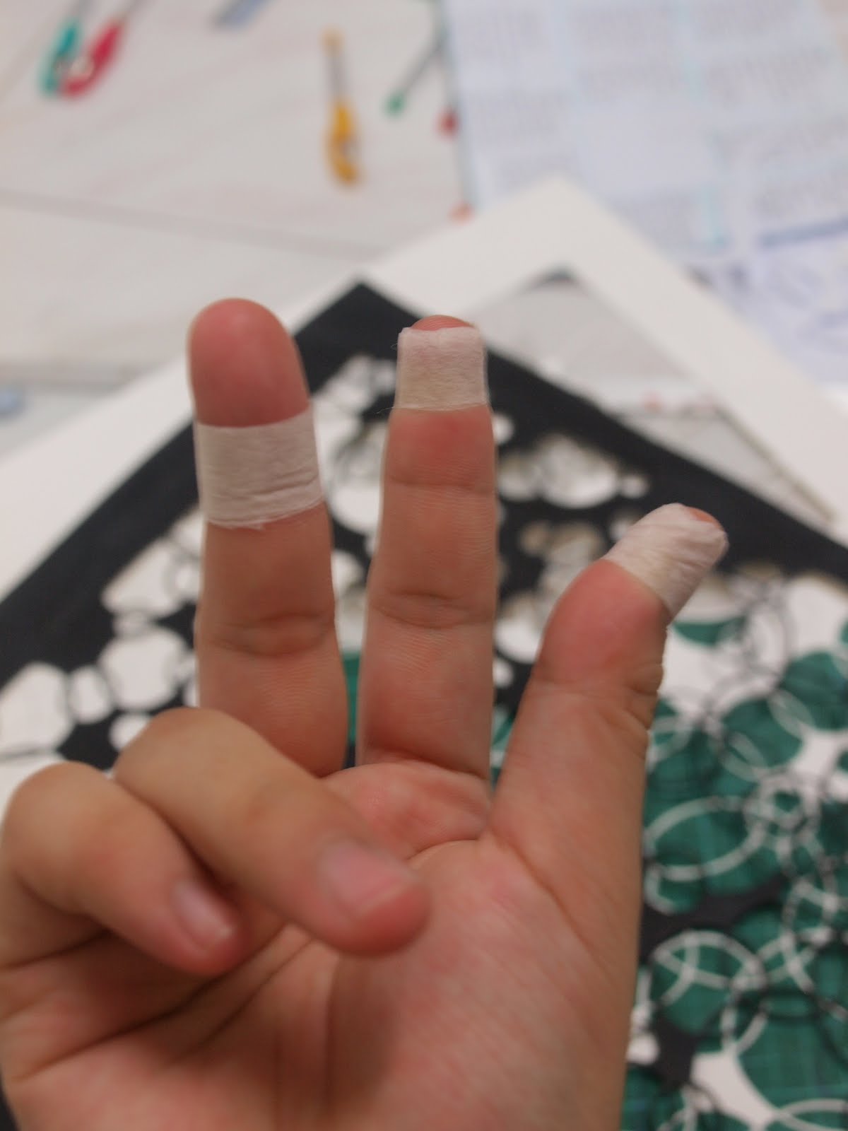
they are killing me

painted black :D

i placed it on mama's painting :D
i think that the effect is quite nice :D

but my poor fingers are suffering badly D:

Thursday, September 8, 2011

more final on the way

hello! final work teaser :D

photos taken a while ago:D


and a bit more prep